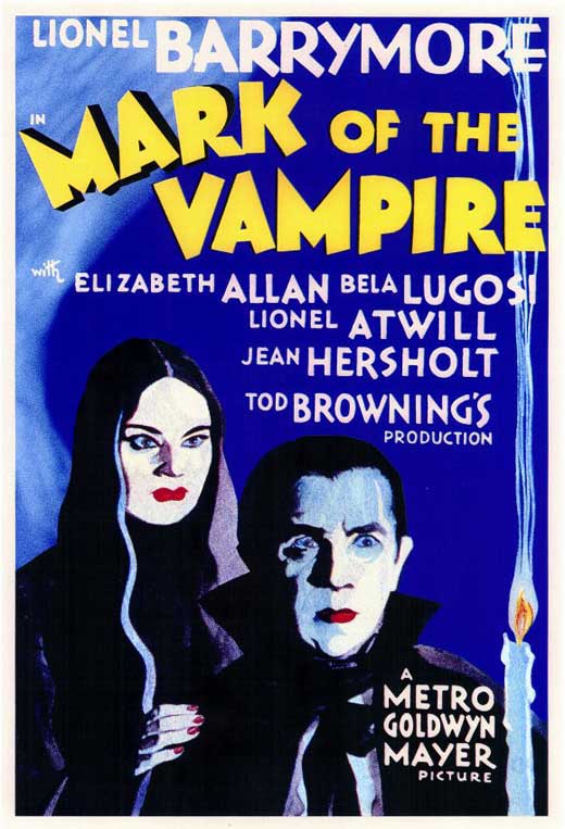
Last night, I was looking at the ebay image of this poster, after I posted the image of the OS from the pressbook and things began to catch my eye. In looking at the ebay copy of the
MARK OF THE VAMPIRE OS, and comparing it to the Style D image directly from the pressbook, there are some slight and not so slight variations in much of the artwork and font styles.
* Lugosi and Borland's faces appear to be hand rendered on the ebay copy, rather than the photos that were used on the PB one sheet. Both faces are lacking any color and are more washed out. The pressbook poster has each actor with very white faces, blue shadows across Lugosi's forehead and cheeks and each have intense, red lips. The part in Borland's hair is also different on the 2 versions.
* Lugosi's left ear (in shadow) is much more prominent and extends out further on the ebay copy. Note that on the pressbook image, that same ear is little more than a pointed "bump" on the side of Lugosi's head.
* The shape of the candlestick varies. The left side of the candle on each is markedly different, with the ebay candle being more a straight line from top to bottom; the PB version shows areas that are uneven, as tho melted in spots.
* The smoke whisp lines that rise to the top of the page are slightly different and dont quite match. Note how they all touch next to the T in Hersholt, on the pb image; they do not on the ebay image. The candle flame art is also slightly different.
* The word "A" is missing above the word, METRO, on the ebay copy. And the "do not reprint" watermarks do not appear to be blocking it, as is evidenced higher up on the poster, where credits can be read through the watermark.
*The title font color is different. The ebay version is green; the pressbook (and a reproduction found on Moviegoods, which I used for the larger image only), both show the font to be yellow.
*The font style is slightly off on some words. Look at the letter A in Elizabeth and in her last name, ALLAN. On the pressbook version, the openings above the cross line of the A's are quite small; on the ebay copy, that open area is much larger. The Z in Elizabeth is not the same, and the capital E, in BARRYMORE looks slightly different, with the center leg of the E being a bit higher than on the PB image.
*On the pb version, the letters G and O in Lugosi look to be thicker, when compared to those on the ebay version.
*The letter O in the title "OF" has a larger center opening on the ebay copy, when compared to the pb style D version.
* The tail of the letter R in Hersholt extends below the S on the pb version; on the ebay copy, the bottom of the two letters are even.
One last difference, too, is the area of Lugosi's tie, the cowl under his chin, and areas of his shirt that are visible. On the pressbook one sheet, the tie in not as detailed, the shape of the tie that hangs down is different and the small triangular area of white shirt that is just to the left of the letter M of Metro, seen on the pb version, is no where to be found on the ebay copy. Also, very little of Lugosi's white shirt is shown at all on the ebay copy; not so, on the style D, from the pb.
So is the copy on ebay a first release? IMO, this looks to be something possibly done later, using the original pressbook one sheet as a template. Too many things appear to be inconsistent, when compared to to the image from the pressbook.