Unfolded my copy today, and was a bit taken back by what looks like fold lines or creases of sorts on this design...but aren't literally folded. My first inclination was that it was an old fake, since the paper weight, feel, smell, etc...all checked out. However, the GAU info was sharp and correct, as are the four corner markers.
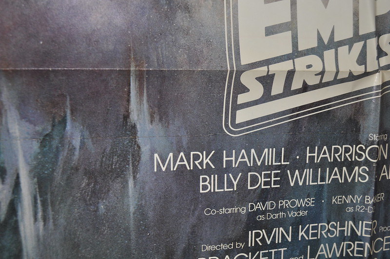
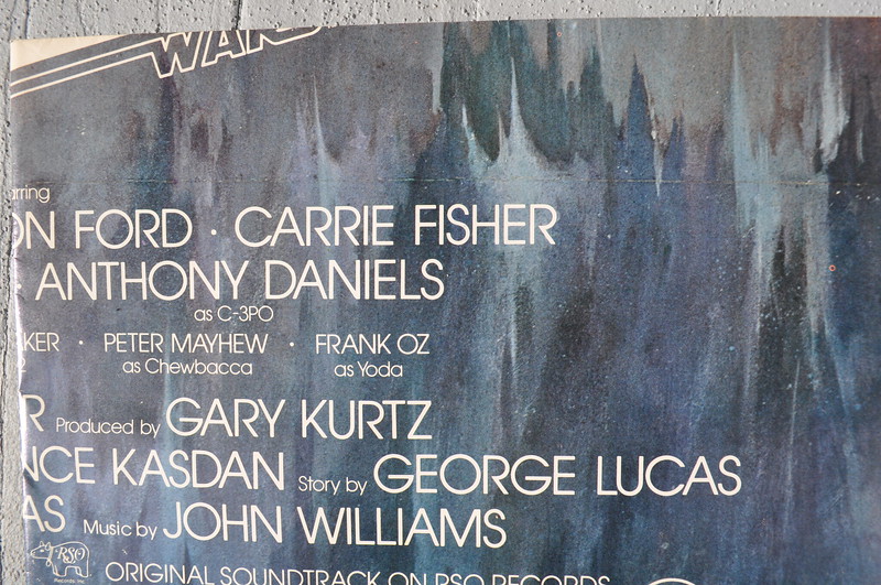
There is one 'fold' that is under the bottom horizontal actual fold, just above the top credit line, and beneath the ESB title graphic. The line extends the entire width of the poster.
Here are pics of mine, not the best, and not the clearest, but will give you a decent picture of what I noticed:

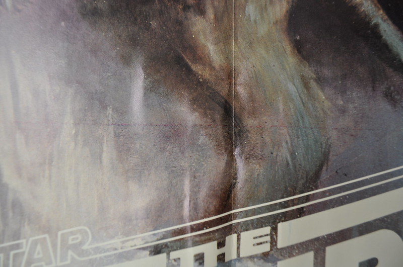
The second 'fold/crease' of sorts is through the lower half of the Taun-Taun that Luke is riding. This line is a purplish hue, and does not extend to the borders of the poster, but only extends in the middle third of the width:
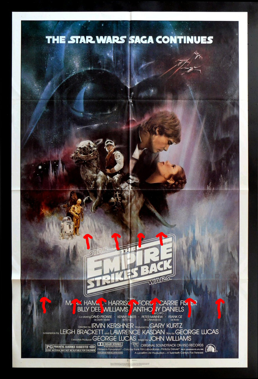
Here is a pic I stole from Dave to put some crude red arrows on for points of reference:
Thoughts?
After proving my theory that it is indeed an original off of Dave's and other stock photos, was that the purple line was a reference line for the artist in terms of placement. Not sure what the bottom/larger 'crease' is. It literally looks like someone scanned a folded poster. Have never run into this before...what do you guys think?


