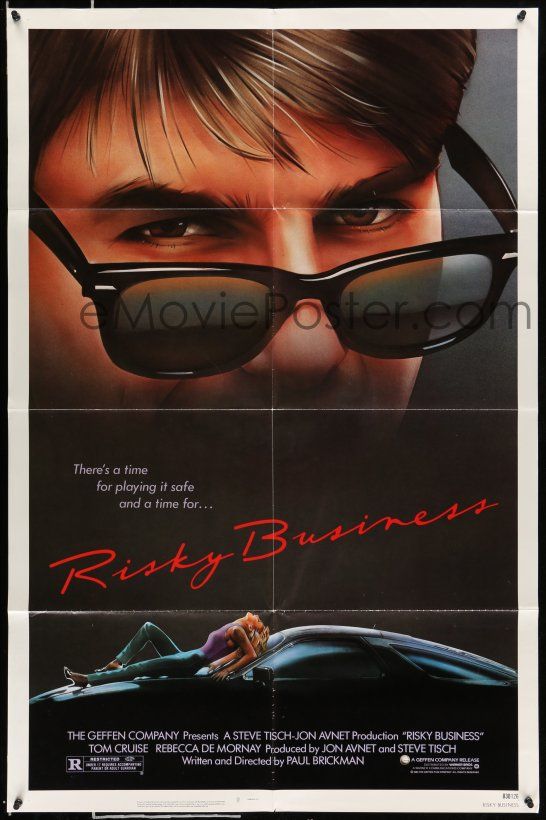
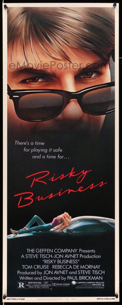
Here is an interesting case. I have the Risky Business insert. The graphics are pretty much the same as the 1 sheet, but they added space and text between the Tom Cruise image and DeMorney on the Porsche. To my eye, that added distance adds some dramatic tension to the poster. I get a stronger feeling from the insert. Comments?