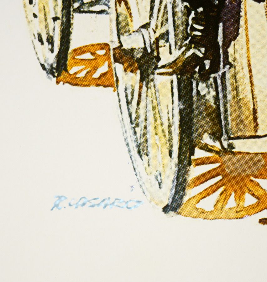
Hey Terry, I was looking at a number of the great closeup images on Ed's Filmonpaper site, showing Casaro's signature. I think your first hunch is correct that this was more a quickly written signature, along with the offset printing, resulting in the more "B-looking" letter "R."
When looking at the art style, is certainly looks to be Casaro (imo). Here's a C/U, borrowed from Ed's site, (thanks Ed!!) for the '78RR German poster Casaro did, for
For A Few Dollars More.
Here too, the printing quality makes the letter R look a bit mushy.
His sig became more neat and block like, it seems, too, as the years went on.
Ed, what do you think, when you look at the name on the Dracula piece?